Broker: Centralized Research and Analysis for the day-to-day
Role: UX Researcher & Designer from Concept to Delivery
Responsibilities: Conducting interviews, digital and paper wire-framing, low fidelity and high fidelity prototyping, conducting usability testing, and design iteration.
Duration: 12 weeks

Project Overview
The Problem
As of this writing (February 2022), misinformation is prevalent. It requires research and access to experts to create an informed opinion both of which demand time and research proficiency. People are busy, Broker offers a tool that fits in your pocket and allows you to access valuable information for decision making and informed opinions.
The Goal
This project was created as part of my Google UX Design Certificate. I wanted to design an app that facilitates easy access to expert opinion and helps your everyday user to make informed decisions.
The Product
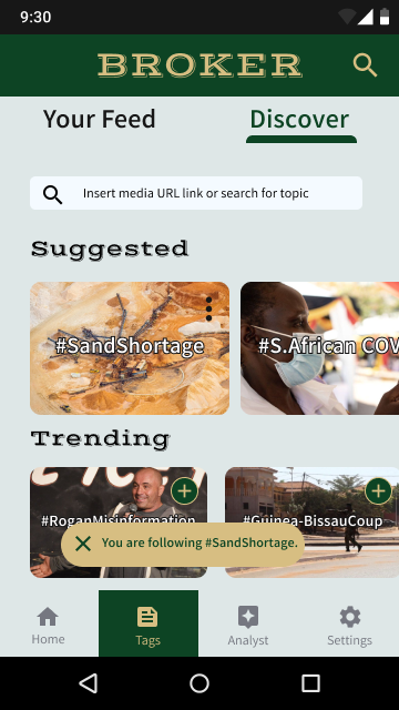
Broker is a mobile app designed to offer centralized information, expert analysis, and testimony for the everyday person to make an informed decision. Your pocket information brokerage, for when you want to contest points or just want to know more.
Understanding the user
When considering a social good, I decided on an issue that seemed to be very prevalent in social media and news with an eye turned towards the wild speculation and rumors of the COVID pandemic. From there I extrapolated a need for easy-to-use and easy-to-access expert testimony and analysis.
Most people don’t actively research, they don’t have the time and energy to do so. With this assumption in my mind, I conducted five interviews, focusing on the interviewees’ opinions on the prevalent misinformation surrounding COVID, difficulty of research, and how they would like such issues to be addressed.
From the five interviews came several common threads: time and experience required to conduct effective research. the amount of funding required to incentivize experts for analysis and the scattered, obfuscated nature of quality information. Consolidation and addressing time/experience required on a mobile platform for ease of access became my driving focus.
Pain Points
Busy and Tired
Users brought up how their day to day was busy enough, to speak nothing of spending energy to research sources, testimony and information.
Scattered and Obfuscated
Finding the points you need is not easy for your average person. How can you expect people to come to a well informed opinion with anything approaching the speed of misinformation.
Meet Ann
Ann is a busy marine biologist who needs centralized, easy access to expert opinions and testimony because she wants to focus more on analysis and making decisions.
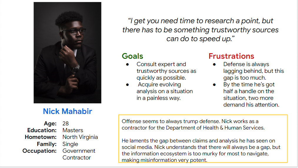
Meet Nick
Nick is a concerned contractor working for the HHS who needs quick access to analysis and data to better combat the flow of misinformation.
Competitive Audit
This audit incorrectly focused on news aggregators that centered on giving a balanced diet of news sources. I believe now that I would have liked to focus on think tanks. Collections of experts writing analysis and think pieces backed by education and research. While think tanks displayed great information on sites, their reach on mobile platforms was a glaring omission for Broker to step in, merging the aggregator nature and think tank analysis.
IDEATION
Crazy 8s yielded some unique initial designs, but given I was designing a more unusual experience, I decided to focus on familiar app architecture. For content, I would focus on analysis of topics that users may be curious about.


Digital Wireframes
Hotspot News
One of the most helpful features I can think of is displaying where something is taking place, which is why the global hotspot map plays a central role in all mockups, wireframes, and prototypes.
What topics are you into?
The Tag system is an organizational system that many people have familiarity with and all my testers immediately picked up on.
Your Analysts
Continuing with the theme of knowing where your information comes from, the analyst page was inspired in part by the Pokemon Pokedex, specifically the attribute tags.
These tags display information that could help users decide if they like this analyst. Users seemed to like knowing what type of attributes their analysts had in testing.
Usability Study Findings
Link to app low fidelity prototype
The main flow is to find some analysis on the Ukraine situation or the US housing situation. Users are here to find information to make decisions, everything else is subordinate to that. The map function and home page were eventually fused, as users rarely felt the need to use one or the other. The search function was given more prominence in later incarnations as it was the default approach most users had to find information.
Taking some cues from the app testing, the mobile web retains the map/home page fusion as well as a header with a search function front and center, before the hamburger menu. This flow starts from the home menu and follows several ways to find different analysis pages.
FINDINGS
The search bar is king.
The uncontested king of attempted pathways, search bars are the first stop for any pointed questions users may have. The one thing that separates this app from a search engine is.
Maps and Usability
The map, while theoretically nice was often a source of confusion, users required some indication on how to use the map before they started to interact with it.
Political Distribution
The political distribution of analyses for a situation was very ambiguous. Users were generally unable to parse what it represented at glance.
Refining the Design
Mobile Homepage
Creating a much more visible map was a prime goal. Especially choosing a color that pops against the map’s blue and can complement the green. Besides that, marking the currently activated interactable so it’s easy to read and visually distinct.
Low fidelity prototype: mobile home screen
Mockup: Mobile home screen
Mobile Website Homepage
Maintaining continuity from the app to the mobile desktop was my main goal, so this design takes a lot of cues from the one chosen for the app. It being on a website allowed me to implement more information upfront for users to consider when they look for analysis, to admittedly mixed results.
Low fidelity prototype: desktop home screen
Mockup: desktop home screen


High Fidelity Prototype
Mobile App high fidelity prototype
Click here to use the app prototype.
The designed path for the app was that users would choose to search for any immediate questions, while the map and hot spots would allow users to scroll through pertinent stories and analysis. From testing, more arrows were implemented to indicate dragging elements on the home page and on the analyst page.
Click here to use the mobile website prototype.
The mobile website's high fidelity prototype follows the same flow as the app: Users use the search bar, scroll on the map or click on one of the displayed apps. Two of the more prominent user changes were to make the map easier to read via colors and to add a notification to tap and interact with the map.
mobile website high fidelity prototype
Responsive Design
The mobile website high fidelity prototype follows the same flow as the app:
Users use the search bar, scroll on the map or click on one of the displayed apps. Two of the more prominent user changes were to make the map easier to read by making the colors contrast more fiercely and to add a notification to tap and interact with the map.
Sitemap
My primary concern was to maintain a sense of continuity, similar map, similar tags, similar color palette. I decided to remove the initial analyst political distribution line, which was met with mixed reactions and confusion for the web homepage.
Takeaway
Impact
Participants remarked that they would appreciate the centralizing nature of the app, as it cuts down on the time they would have to use to properly research themselves. One user remarked:
“I think this would be useful and easy, being able to whip out my phone and search or be notified to things that I should know about is a great utility to have.”
Personal Learnings
Color design is relatively simple relative to deciding on information clarity that can bias users to only read certain types of analysis, which is against the idea of the app providing useful analysis regardless of origin. Mechanically, I struggled with the designing of the app before confirming that it’s okay to just make, judge, and then iterate. Designers don’t need to smash the ball out of the park on their first try.
Next Steps
Test user reactions regarding analyst political leanings up front versus after the article. User responses to the political leanings have been mixed and the feature has specifically been pointed towards something that may bias users.
Implement a system that allows users to access content via alternate methods. Users that may find it difficult to pay a lump sum should still be able to access analysis on important subjects.
Design and test a low internet version of the app. Broker should be easy to access. Mobile users are the largest market, but this app has a bias toward more developed infrastructure. To include upcoming users, it would be ideal to create a more austere version that focuses entirely on pertinent content and less on visual design and media.


