SARAS:
Ticketing for the classic music lover in Mumbai
Role: UX Researcher & Designer from Concept to Delivery
Responsibilities: Conducting interviews, digital and paper wireframing, low-fidelity and high-fidelity prototyping, conducting usability testing, and design iteration.
Duration: 8 weeks

Project Overview
The Problem
Ticketing apps in the west do not offer coverage and features for international concerts and patrons.
The Goal
This project was created as part of my Google UX Design Certificate. The primary goal was to research and design a minimalist interface centered around the ticketing process.
The Product:
Saras, a nod to the Hindu goddess of music, is a concert ticketing app catering to classical music lovers, both international and domestic, in Mumbai.
Understanding the user
I conducted interviews and user research primarily with people who have used ticketing apps while secondary research was spent researching mean age for classical music events.
The primary user group that emerged was that of an older adult, typically older than 40+. These users had issues with tickets being purchased by other groups while they were going through the process.
Research conducted confirmed that most classical music patrons were older adults, but the primary concern they brought up, the opaqueness of the ticket supply, was surprising. In addition to this ticketing issue, users were concerned with the lack of clarity, embarrassment, and lacking experience using ticketers.
Pain Points
Where’s my ticket?
Users were concerned with their ticket being taken from them by faster shoppers.
Why is it so hard?
Interviewees often brought up how unwieldy or difficult the process of buying tickets was.
Meet Anita
Anita is a retired grandmother who needs an easy to use ticketer app because she wants to buy tickets at her own pace, without the stress of her tickets potentially disappearing.
User Journey: Task List
I believe that for most ticketer apps the flowand tasks are mostly the same. Anita’s fastidious nature warrants adding an extra check of tickets.
User Journey: Feelings and Adjectives
The feelings of frustration and anxiety that not having ticket security can instill in a user spoke out to me. My research indicated that for users of all levels, the process of using ticketers is mostly anxiety until the purchase has been confirmed.
User Journey: Improvements and Opportunities
Initially focusing the app on nearby concerts was the plan. As research and design progressed, the app became more in line with Ticketmaster, Tickpick, offering a range of locations and shows.
Starting the Design
After taking in Anita’s user journey, I tried a new technique in the UX storyboard, creating both close-up and big picture boards.
From there I started a series of quick sketches, wanting to get several ideas out that could fulfill her needs as well as offer a rough idea of what the app should look like.
I made it a specific point to try to sketch something that is “unconventional” in some way, specifically to experiment a little with guiding the user along the process using shapes not usually seen in apps. I learned that certain shapes were conventions for a reason!


Digital Wireframes
One of my primary concerns was informing the user of the ticket hold or the moratorium. Initially, I believed that putting the hold at the top of the app would make it obvious to users. In testing that did not prove to be the case.
Buying Tickets
The review would reflect changes in currency and ticket amounts. Its unique shape would draw eyes to it as well. In practice it garnered mostly neutral and ambivalent reactions.
One of my primary concerns was informing the user of the ticket hold. Initially I believed that putting the hold at the top of the app would make it obvious to users.
SAving Space
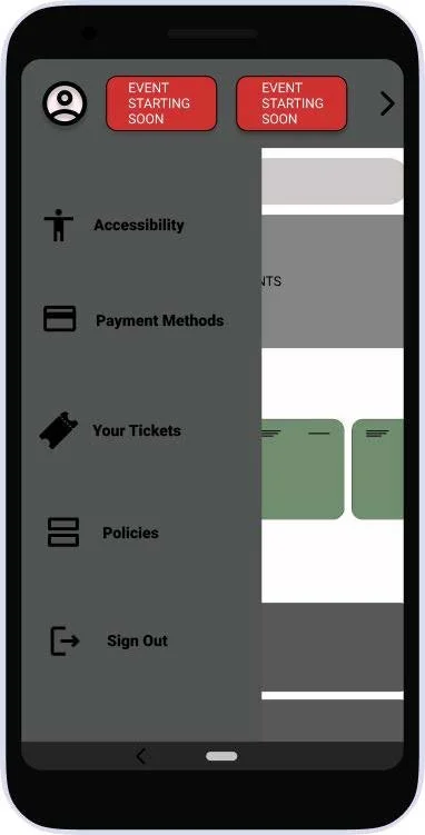
Condensing the options to the most important and placing them within a hamburger/profile menu reduces user decision fatigue.
This was in theory a good idea, it played out differently in testing. Users required experience with apps already. Many of the older users did not grasp that you could find information in this way.
Your History
The final consideration for Anita, double checking and confirming ticket purchase. Images were placed to the left so that it would be the first thing parsed and help users remember what events users went to.
Usability Study Findings
In deference to the climate at the time, I conducted two, remotely moderated usability tests. The first, the low fidelity prototype helped define where my understanding of ticketing apps was lacking
Round 1 Findings
Click here to see the lowfidelity prototype.
3/5ths of users were unable to find the ticket moratorium
3/5th of users wanted a more obvious cart function
Every users first instinct was to look for a search bar.
Changing the copy to employ less jargon (IE "accessibility -> settings”)
Round 2 Findings
Click here to see the high fidelity prototype.
Less experienced users had no idea what a hamburger menu was.
An explicit “you’ve successfully purchased tickets” was missing.
Venue reviews and Cart were difficult to find.
The app feels like it has no visual identity.
Refining the Design
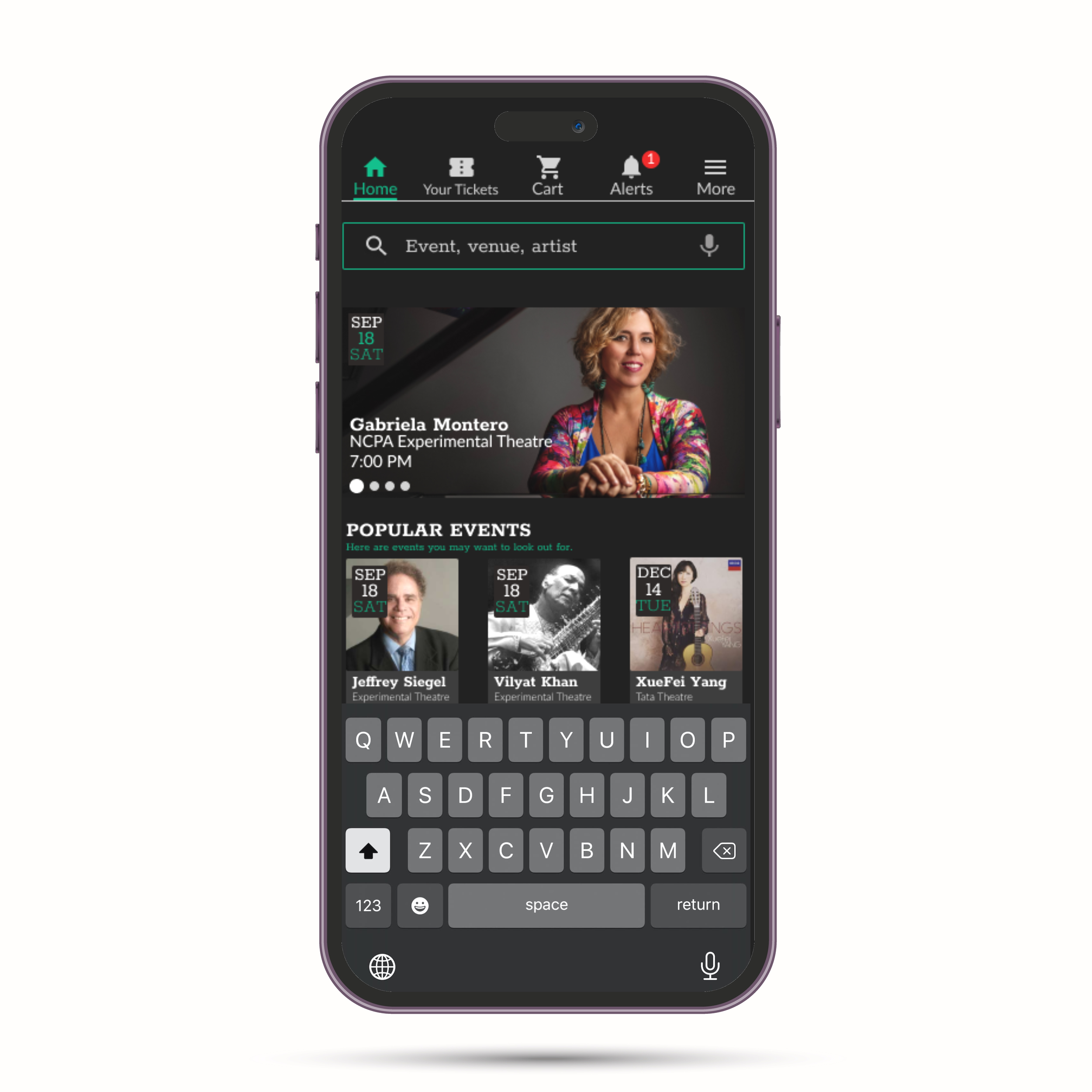
MOCKUP: Homepage
Though the users were polite, many of them remarked on how bland the app felt. I felt it imperative to at least narrow down on an appealing, uniform look for the app.
MOCKUP:
Besides unifying the color and creating a sort of “seat-availability gradient”, the review button here was a source of debate. Where it should be placed, what was in the button, if it should even be available. I eventually sided with the majority vote of reviewers: available, centered, reviews and stars at the ready.
Takeaway
Impact
If there’s one thing the current mockup is good for, it’s garnering aesthetic approval:
“Ooh im liking the darkmode +pine green. subtle and classy.”
The functionality of the app itself has garnered approval, with one participant remarking:
“It’s loads easier than my experiences with other apps.”
Personal Learnings
Using conventions such as the hamburger menu may seem fine, but in reality it often confuses less experienced users. Transitioning to searchbars or voice command are things I intend to focus on as it reflects the path most if not all users took.
Next Steps
Conducting another usability test, to see if the all previous pain points have been addressed and to confront the new ones that may arise.
If there’s one thing this session could do more with is a wider range of user opinions. Conducting the survey with a more international bent would be great.
Testing more differently abled people would be a great step. Testing the app’s visibility to users who are colorblind and have motor difficulty are at the top of the list. Their feedback would strengthen current accessibility and open the road to more options.


